You are Invited

This is an invitation i designed , i really enjoyed using all the 3d objects alongside the 2d images and type. I'd love to try something like this again, it was a really fun putting everything together for a final image.


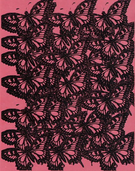
Here i've contrasted the background of mark making with a bold illustration on top. Sometimes working in black and white can be boring but combining it with the brown paper makes it more interesting. I'd like to try some more illustrations on coloured paper.

What's the Plan?

I need to widen my skills within illustration, so this means more experimantation. Doing some more life drawing would be great, and increasing the time i dedicate to drawing will definately help.
I love screenprinting so i definately want to do more of this, learn about the process and look at layering colours to create a more complexed final outcome.
My skills and knowledge of applications like Photoshop and Illustrator are not good, so i really want to work on this and see how it can improve and change hand drawn work. There's alot to explore and experiment with using this technology, so i need to get to grips with it.
Recording daily- i need to start recording images and ideas on a more regular basis. Even little things could be the start of some really interesting ideas.
Children's Books- i really love the idea of being a children's illustrator so i will research into this market. I want to look at the types of books that todays children enjoy as well as classic illustrations from the past.
Work Experience is essential, so i will look into finding a placement for next year. Visiting The Workshop made me realise how important experience is so i definately want to get a taste of reality in the design world.
I'd like to build a website with a more personal touch , in order to start showcasing my work as an illustrator.
Constant research online ~ looking at illustrator's blogs and websites, as well as visiting any exhibitions .

Who Inspires Me


Stina Persson

http://www.stinapersson.com/


Kate Sutton

http://www.katesutton.co.uk/


Peter Blake

http://www.artnet.com/artist/2582/peter-blake.html


Lauren Child

http://http//www.milkmonitor.com/


Lisa Schibel

http://www.lisaschibel.de/


Ryan McGinness

http://www.ryanmcginness.com/


Lucy McLauchlan

http://www.beat13.co.uk/


Catalina Estrada

http://www.katika.net/

Illustration. Final Answer?

Definition ~
Illustration is the world reflected and represented in pictures, whilst at the same time giving you an insight to other worlds, like a persons imagination. To me Illustration tells stories, sends a message and encourages emotion. Its freedom and creativity combined; you get a blank canvas and you can do whatever you want with it.

Skills ~
Drawing
Painting
Mark making
Printing
Collage
Being able to tell a story through images
Being able to experiment and combine techniques
Being able to create a style that's fitting for the purpose.

A Carrer in Illustration ~
Illustration is in many areas of design, in books and magazines, on record covers, in advertisements, wallpapers, websites, fashion, and television. It seems to be everywhere, therefore the opportunities are endless.

Choosing a Design Specialism


16/11/09
I've been thinking about what design specialism to choose. My initial instinct was to choose illustration, but i'm also interested in motion graphics. Last years animation project was really enjoyable and i've seen what i could achieve in that area of design. At the moment i'm torn, like everyone else i'm finding that its really difficult to make a decision. I'm hoping tomorrows lectures will give me a taste of the different specialisms and that this will help me to choose.

17/11/09
The design specialism talks have given my brain information overload! Its assured me of the areas that i definately don't want to take, however its got me more excited about Illustration and Motion. Also Handmade Graphics seemed really interesting, i'm even considering that as an option.
The lectures have been useful because i think its clear now that many of the specialisms overlap, you dont have to narrow your interest in the whole subject just because you're picking a specialised path. If i pick Illustration i know there's an opportunity to use motion within it, and vise versa .

18/11/09
I think i'm going to pick Illustration. I can't say i'm 100% decided but it was my gut instinct, and it just feels like the right decision. After looking at a friends work i've seen how much Typography is a huge part of it, over many of the projects last year she has included type elements which says to me thats the right specialism for her. I then looked back across my work in comparison, and i can see illustration is at the core, for example the book project; many people focused on type but my work is much more about the images.

19/11/09
I feel completely reassured that my decision to pick Illustration is the right decision. After speaking to tutors i've realised i do put illustration first and motion second, i have a passion for drawing, painting and printing and i'm excited to enhance my skills in these areas. Listening to other people talk through their options makes me see that we're all in the same boat, all trying to see what best fits us, so now we've just got to dedicate to a specialism and see what happens.
The lecture by Jason Arber was really interesting, seeing how his carrer has moved across so many specialisms is a great example that nothing is set in stone. Its good to have skills across the board, which is why i'd do three specialsms if i could, but Illustration has so much freedom that i dont think it will restrict me in terms of a future in design, wherever that may be.

The Consumer

A Monster Project


During this project i did alot of research into brands, packaging and target markets. I've realised packaging has much more of an influence on me than i previous thought, the way a product is packaged is so key to its success and the design holds the power. Although i've found product packaging that really impresses me i've also realised i dont want to be a package designer. There's far too many rules and restrictions, especially with food packaging, and i like to use my imagination in a much more free way.
Creating monster characters out of playdough and plastecine was the highlight of this project for me. I loved pretending i was a child and making colourful modules in any shape i wanted, it was a really fun activity. We went on to create an animation featuring the monsters, this was a slow process and wasn't as successful as i'd hoped. However i still love the monsters and think there are other areas in design to discover where they could be shown off to their best.


Random is in Colour


This is a selection of work i've done using paint, mark making, drawing, and paper cutting. There's alot of colours in these images and i guess that's because i like colour, its all around us and it reminds me of a child's world where everything is in bold primary colours, its an escape from the doom and gloom of our real world.


Innocent as a Rayogram


These are a selection of rayograms i produced to reflect the word Innocent, for my Print to Pixel animation. I used objects like lace and ribbon so the delicate details would be exposed . I drew a ballerina figure and used watercolour paint , i did not expect this to give such a beautiful and subtle result. I love the way the light blurs and fades expressing the dress and limbs of the ballerina in a realistic tone. I really enjoyed experimenting with the exposure of light and seeing how different objects and materials would create unusual outcomes. This was so simple and quick to achieve so; it would be really interesting to look into further for other projects.

Magic as a Visual


These images were created for my Print to Pixel animation, in particular to represent the words magic and hypnotise. I was thinking of magicians in a Victorian England, doves escaping from birdcages, butterflies and their mirrored wings, layered patterns to engage the human eye and
visually bold shapes to stand out in a split second time frame.

Print to Pixel

This project gave me so much freedom, in a way it was daunting, but by the end it was really good for me to see what i could explore. Our starting point was a piece of music, then we had to describe that music in three words. After hearing the song many times i began to understand it further and found it easy to attatch words to it. I chose Innocent, Hypnotise and Magic and from this i began creating images to reflect the words.

This animation includes rayograms, paintings, drawings, layered paper, and photographs. I used stop motion ,transition and moving applications on After Effects. The software was completely brand new to me and I was very slow to beguin with , but i quickly learnt how to apply different techniques.

I would have loved to have more time on this project, I really wanted to animate the whole piece of music, not just 20 seconds of it. This is definately something i want to explore further; i've only seen a glimpse of what is possible in this area of graphic design.

Pattern in Print

1960's style screenprint, with a marbled paint background.


Sketchbook Pages

A Christmas Card / Child Abuse Campaign


Pattern is Repetition


Do you want that gift wrapped?

Art Foundation Final Outcomes


1950's
The 1950's seems to have a completely different feel to the 1960's where so much change took place. I wanted to preserve a classice style in design from the decade whilst at the same time challenging the idea of the 1950's american housewife. Layered screenprints created a texture that seemed fitting for the period. A subtle 'Approved' stamp onto each housewife questions the issues of acceptance in society, and why they were like clones off a production line.


1960's

I have always been interested in this decade, but i think the stereotypes cloud my view. Within this design i wanted to show the fun elements of the time combined with the memorable events . Important faces and images are shown as badges alongside screenprinted flowers of the 'swinging sixties'.


Waste of Paper

Doing this project made me realise how much paper i was using, it made me realise how wasteful gift wrap is. Most people just use it once and throw it away, so i thought about the effects on the environment and how recycling could help.
The design shows birds sitting on electricity wires because there are no trees, their natural habitat is gone because we are wasteful with paper. I used old brown paper bags that had been made with recycable paper to enhance the message. The idea is that you should try to use these gift bags again and again. The bag and it's message, pass it on.